Government Budget Intro
I tend to focus on budget issues in political discussions. I do this because it should be the easiest of discussions. The numbers are pretty black and white. If I cannot have a respectful conversation about the budget with a person, I would not be able to have any respectful political conversation with them. Unfortunately, even this is a difficult conversations to have with many people.
There are some concepts one must understand before entering this discussions. We all have heard that “Liars Figure”. There are many ways that people can deceive while being accurate with their numbers. We learn the proper concepts in accounting and science courses yet we seem to throw them out the window when it comes to politics.
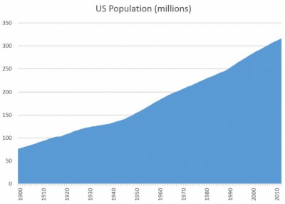
Be wary of people that talk in terms of dollars. It is the easiest way to mislead people. Most people deal with personal budgets that are just a few thousand dollars. It is very difficult for the average person to wrap their head around millions, billions, and trillions of dollars. Those values sound shockingly high. There are over 300 million people in the United States that require various services. The dollar figures get very high very quickly.
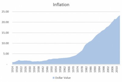
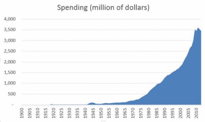
It is important to keep in mind that population growth and inflation make numbers grow pretty rapidly. One often hears how bad the current president is for spending so much more than the previous president. This will naturally happen with population growth and inflation. A lot of data expressed in dollar terms is going to take on the form of the following graphs and really don’t tell you much.
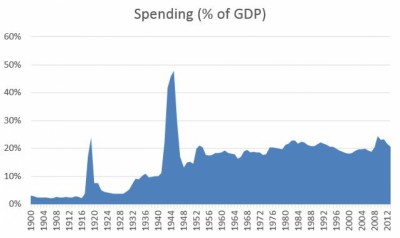
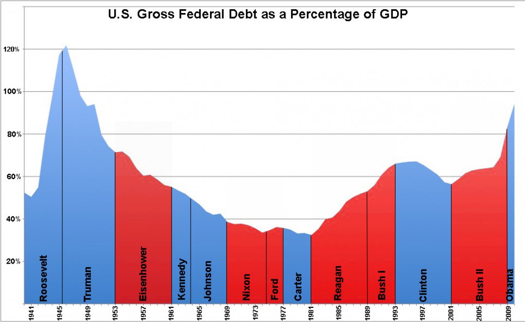
Relative figures are much better, but one needs to be sure to select the proper items to measure relative to. Often measuring things with respect to Gross Domestic Product (GDP) paints a more informative picture. GDP is basically the sum of everyone’s income in the country. It can be thought of as the country’s income. GDP largely incorporates population growth and inflations.
Below are two graphs: one of government spending in terms of dollars and the other relative to GDP. Not much can be extracted from the dollar graph except that more “dollars” are spent every year. It looks very shocking! More information can be extracted from the relative to GDP graph. It is pretty easy to see when World I and World II happened. Even the Korean War can be seen. We can also see how spending ramped up under FDR and stayed up afterward primarily because of social programs and maintaining a strong military. We can also see that spending has hovered around 20% of GDP since Korean War.
